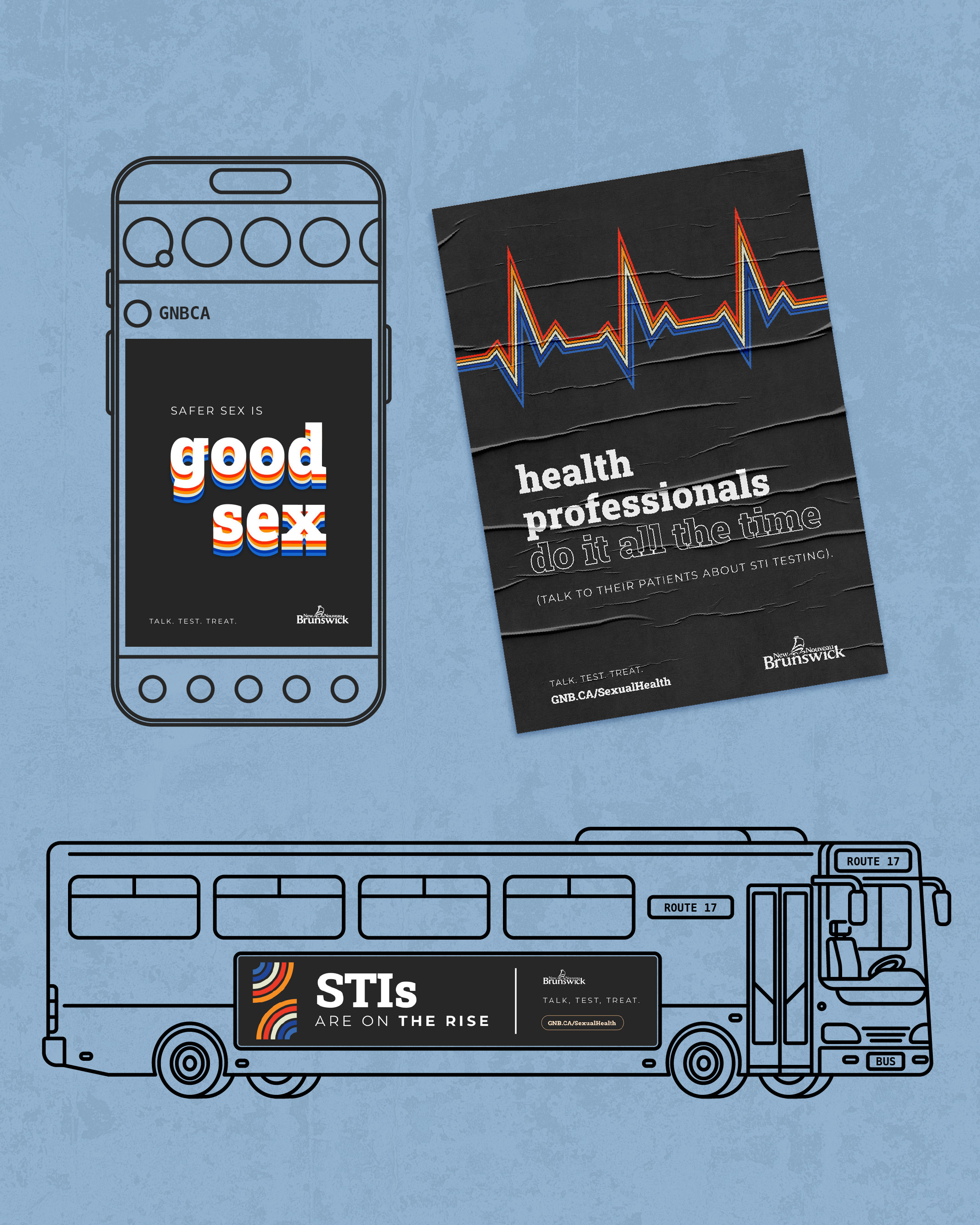

Awareness Campaign
Provincial Sexual Health
Awareness Campaign
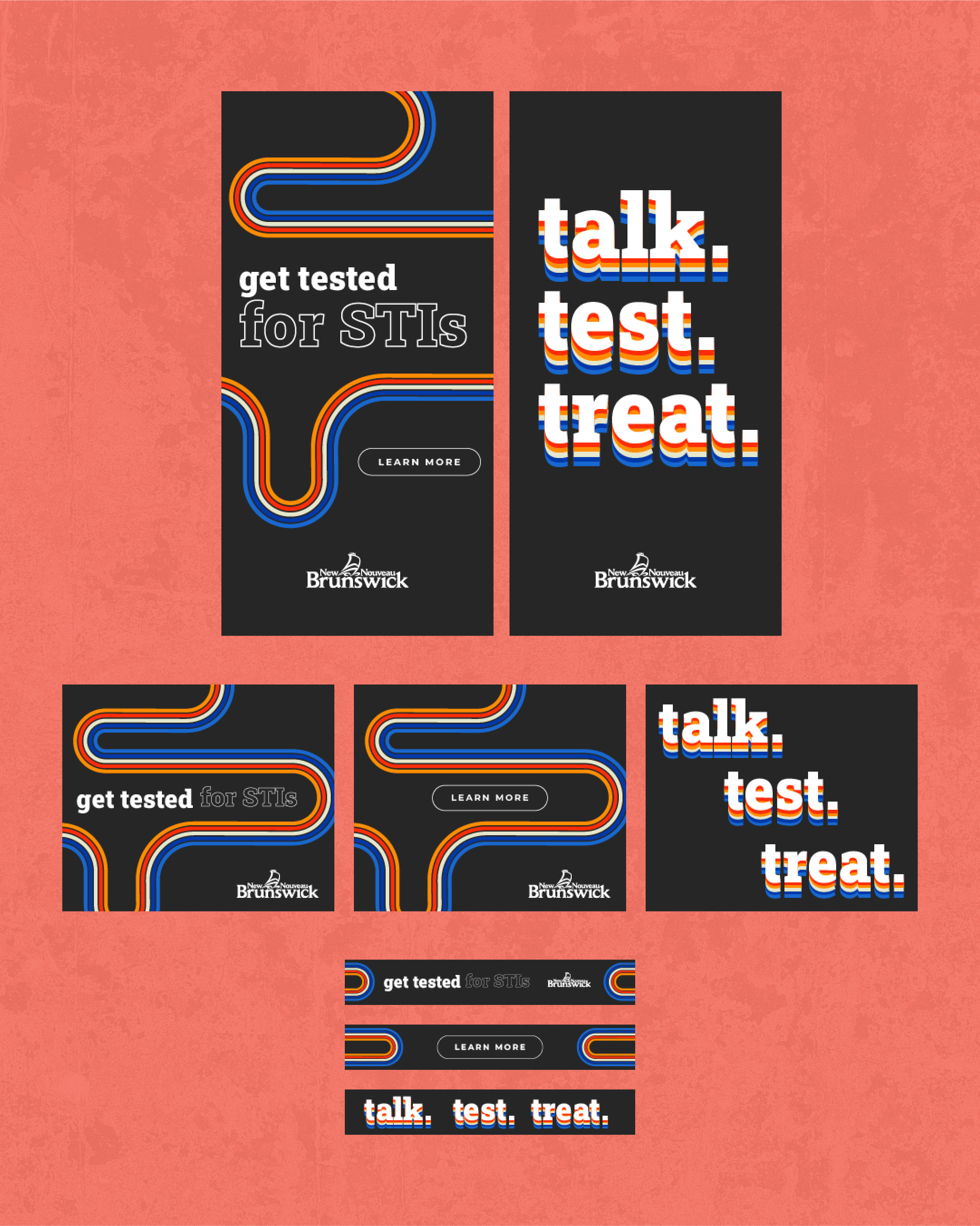
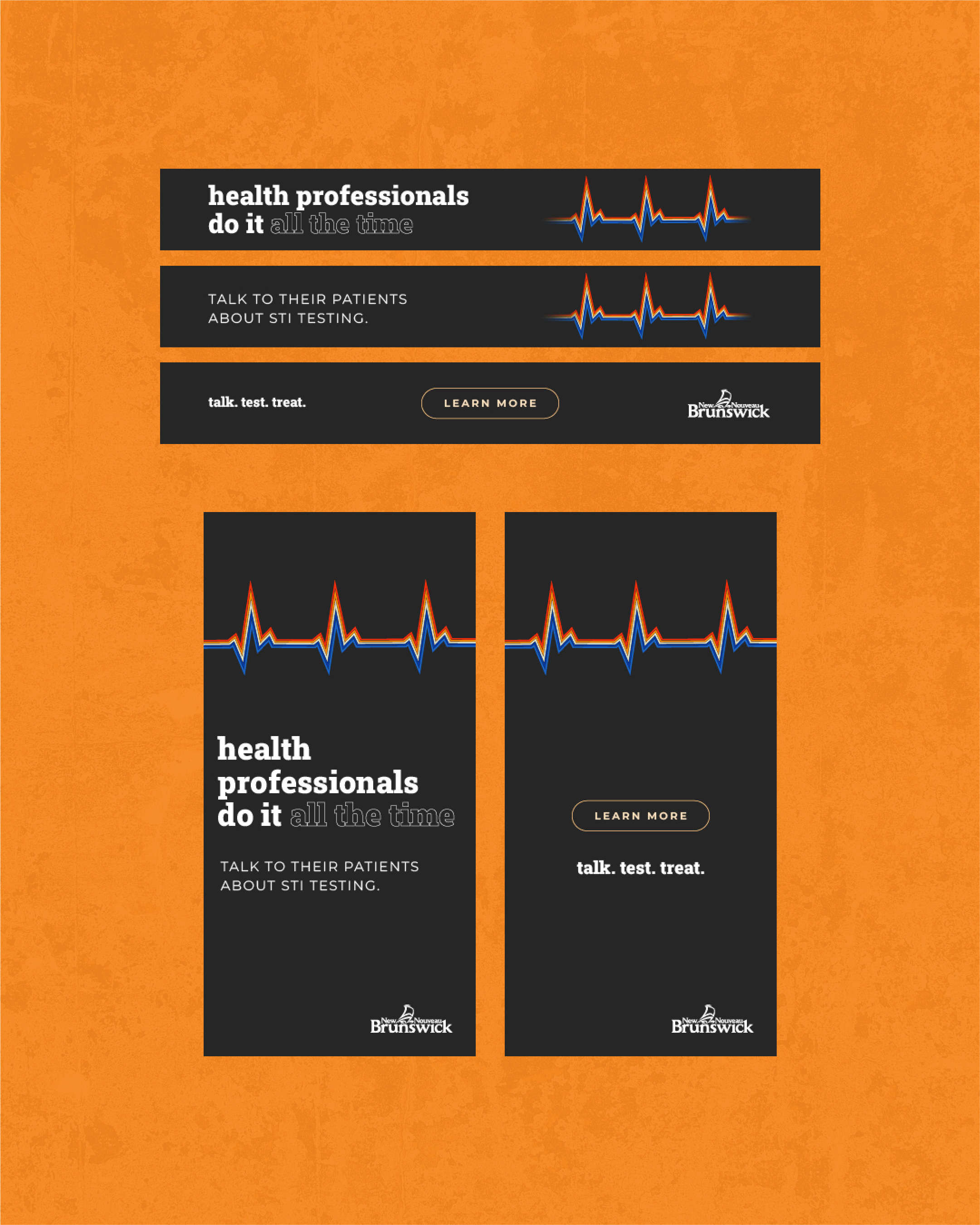
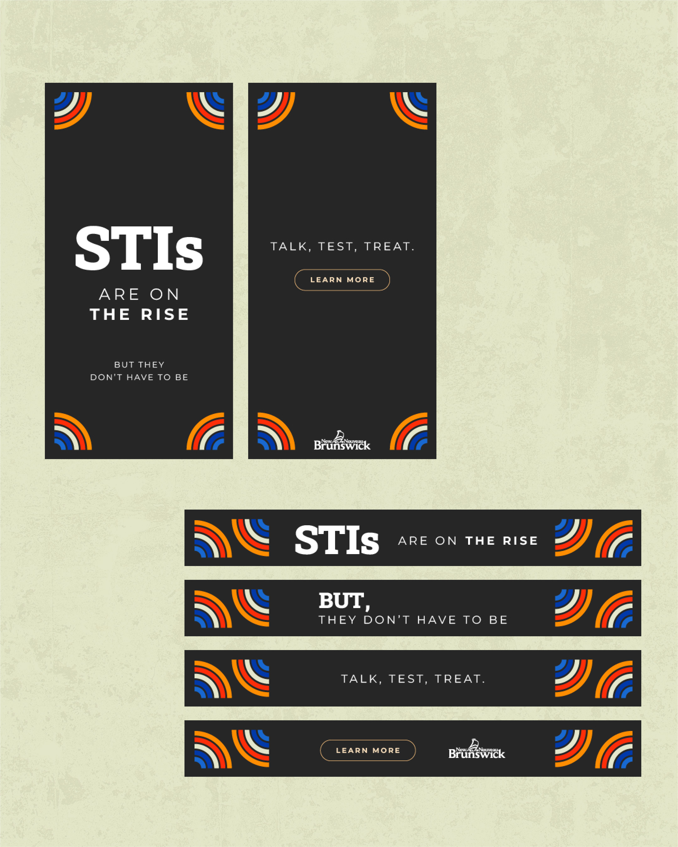
A 70s-inspired campaign that stopped the scroll on a topic people avoid.
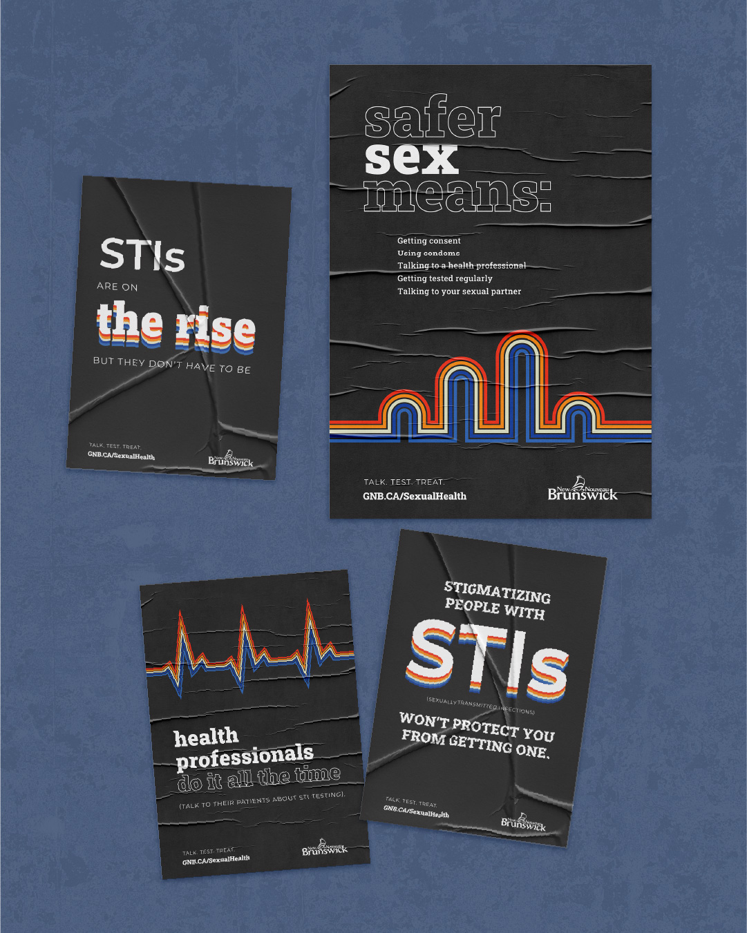
Sexual health is a topic that makes people uncomfortable before you’ve even said anything. The challenge wasn’t just what to communicate, but how to get people to actually stop and read it.
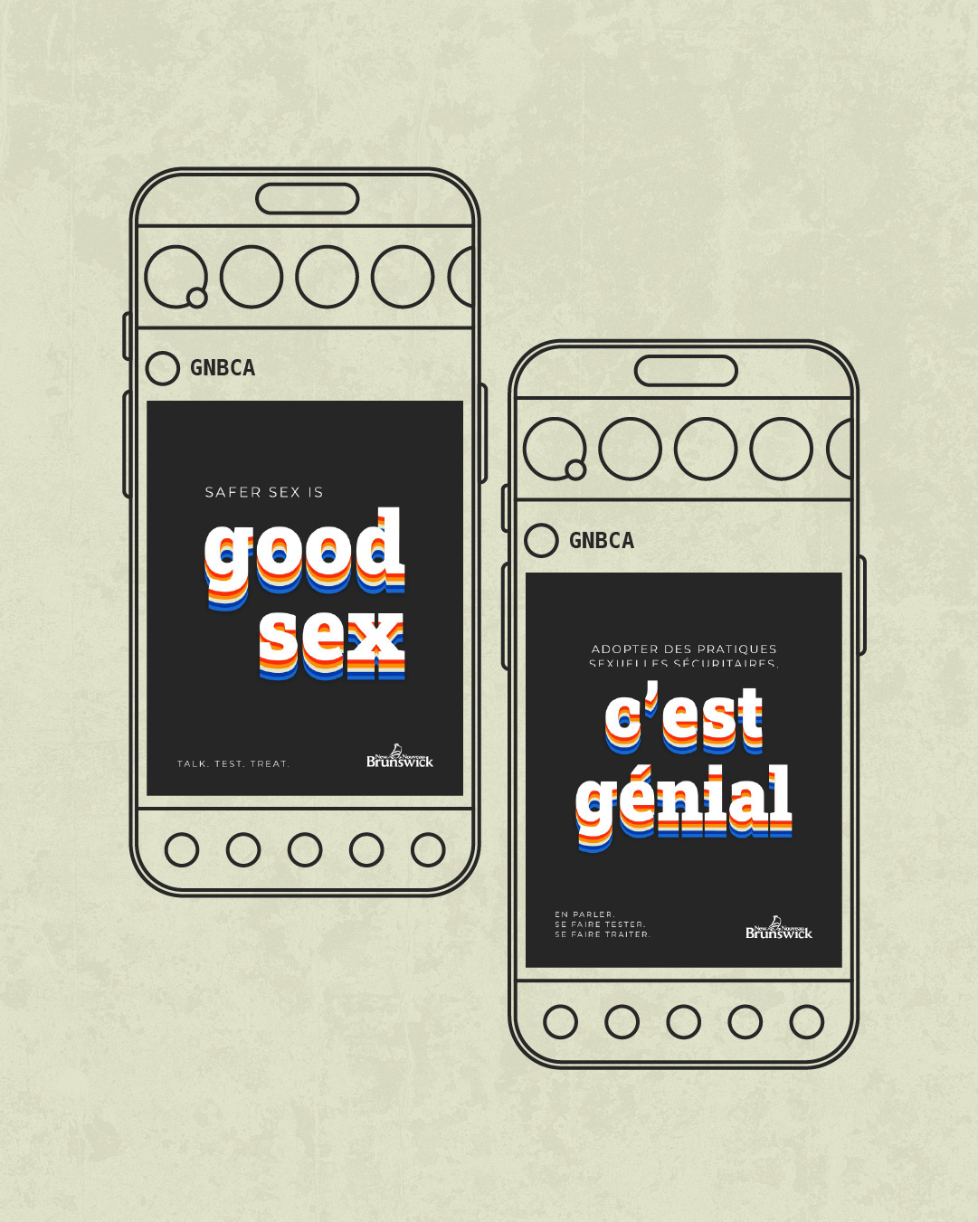
STI rates were climbing and the campaign needed to encourage safer sex across the province. Previous years had leaned into silly, lighthearted creative; I wanted something that could still be playful but carry enough weight to feel credible. A 70s-inspired visual language became the answer.
The creative director and senior director of marketing were both genuinely enthusiastic. The social posts told their own story: more comments and traction than usual, with plenty of people weighing in that the government had no business in their bedroom.
AA
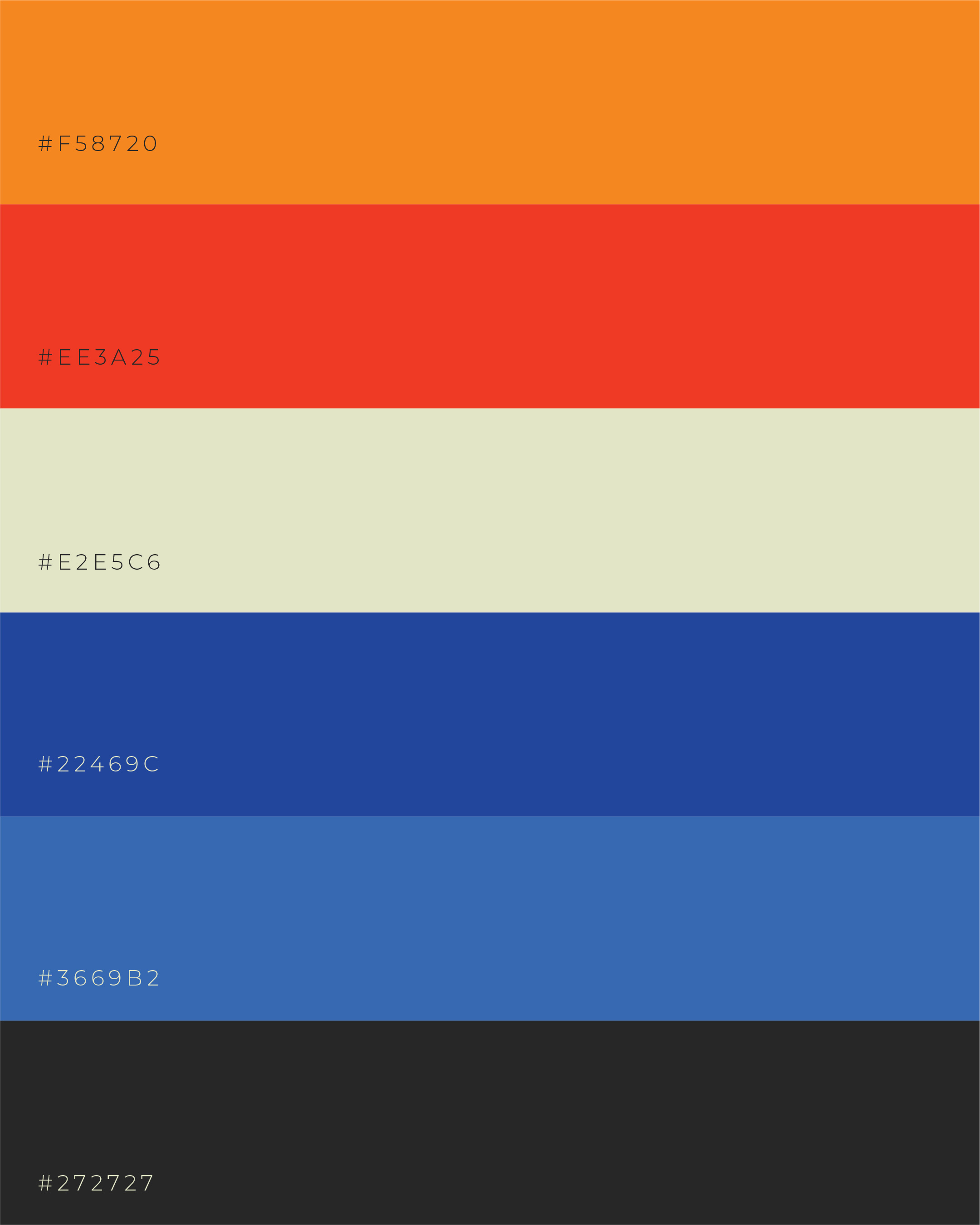
WCAG 2.1 contrast across the palette
EN/FR
bilingual, double the deliverables
People talking, sharing and arguing about a government sexual health campaign is proof of the campaign working. The best creative for uncomfortable topics doesn’t hide from the discomfort.
Real World Conditions
Designed for a Canadian winter.
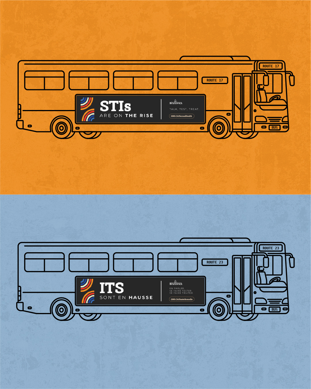
Road salt, sand and snow cover everything for almost half the year. Legibility under real conditions is something I design for from the start.
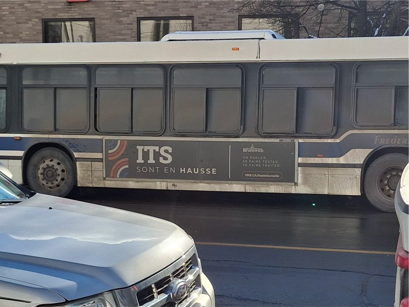
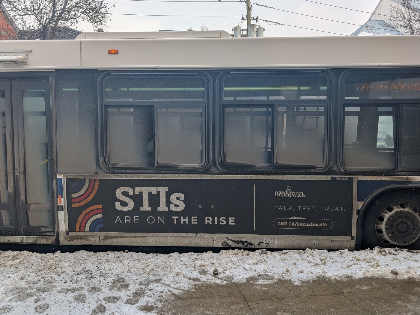
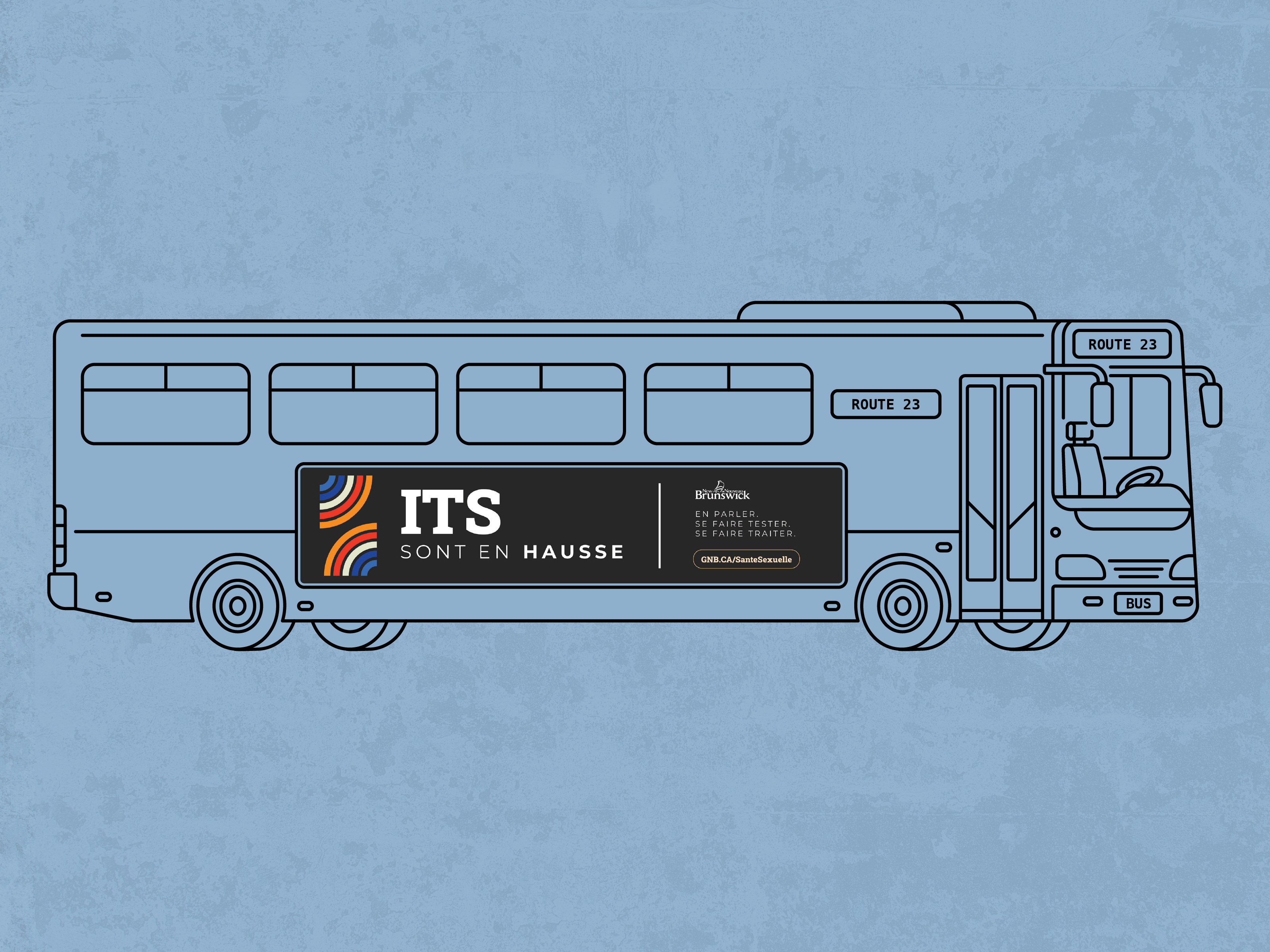
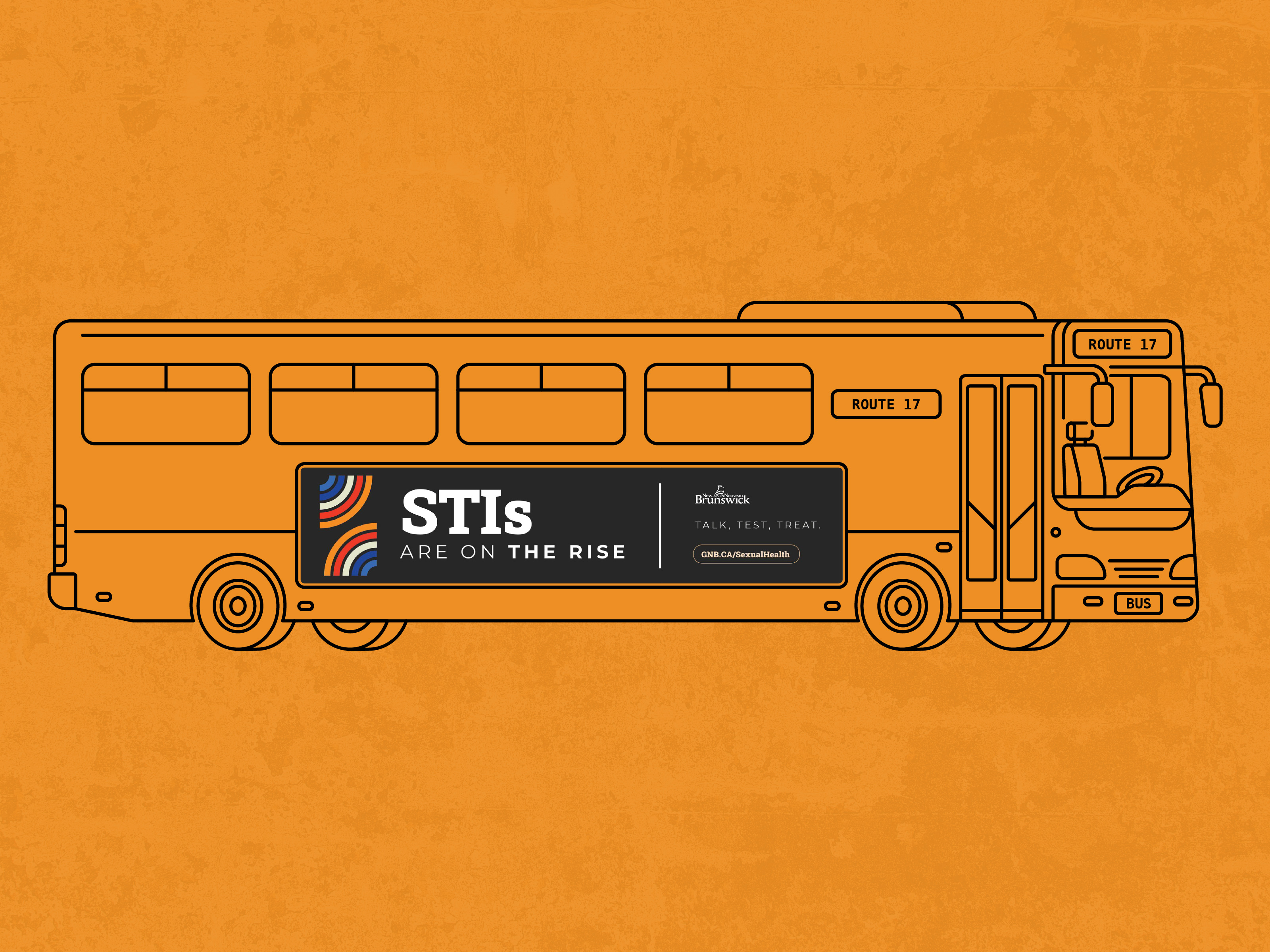
Make them do a double take.
The goal was to stop someone mid-scroll and earn a second read when they landed on the copy. My job was to make sure the design set that moment up.
-
01
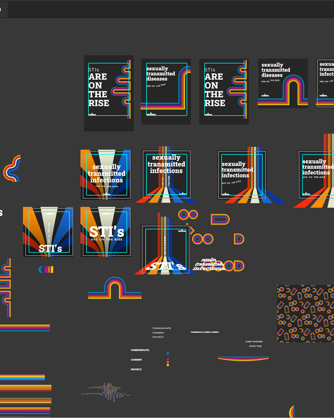
A 70s visual language
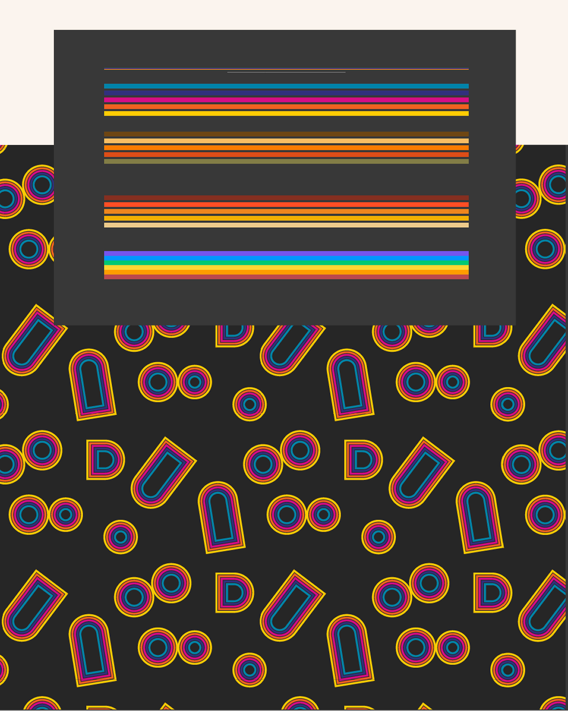
Dark backgrounds, retro striped line work, a restrained palette with simple imagery. Playful enough to pull people in, considered enough to make the topic take it seriously.
-
02
Broad, but not generic
The audience ran roughly 18 to 45, so the creative had to work across contexts. Anything clinical or preachy would only make people look away faster.
-
03
Bilingual & accessible
Everything was produced in English and French, with English displayed primarily, and all colour choices tested to WCAG 2.1 Level AA.
- 04