
Awareness Campaign
Provincial Mental Health
Awareness Campaign
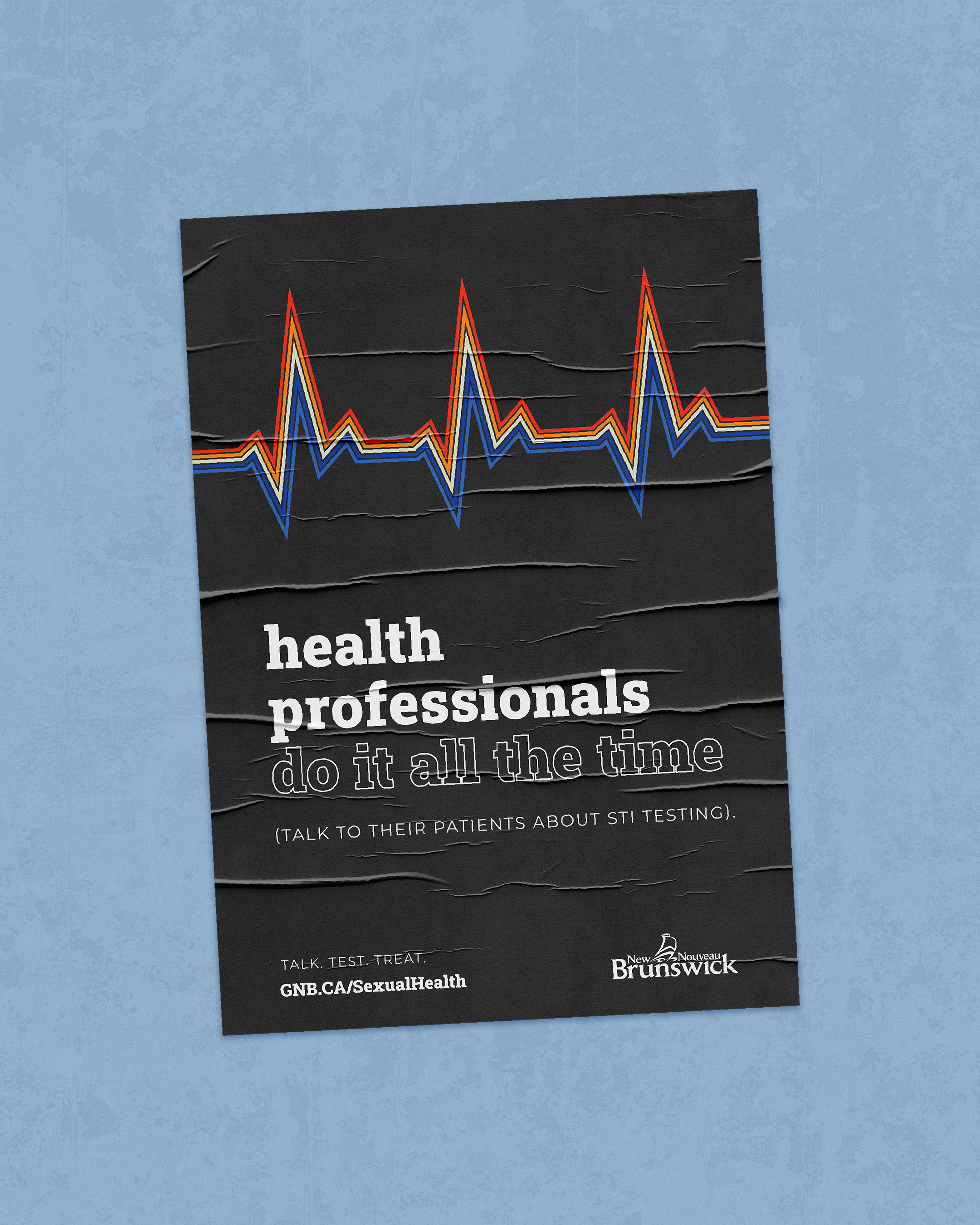
A campaign rooted in colour. Bright and bold, designed to be a deliberate signal of hope rather than crisis.
During the months
the campaign ran,
calls to the helpline
increased by 14%
The goal of the campaign was to make people feel safe enough to reach out, we succeeded.
Mental health campaigns have a habit of looking like mental health campaigns, the muted tones, heavy imagery, the visual language of struggle. For the official launch of the province’s addiction and mental health helpline, I wanted to try something different: what if the design itself felt like relief?
Working within the province’s central marketing hub, I built the graphics for a full multi-channel campaign from scratch. The concept was rooted in colour, bright, bold, unapologetically warm, a deliberate signal of hope rather than crisis.
The helpline existed, but nobody knew it.
Awareness was the problem, and design was the solution. Every decision was made considering someone on the fence about picking up the phone.
-
01
Spreading hope
The goal was for someone to see the campaign and feel less alone before they’d read a single word. Vivid, warm colour blocking carried the whole idea.
-
02
Built to be seen
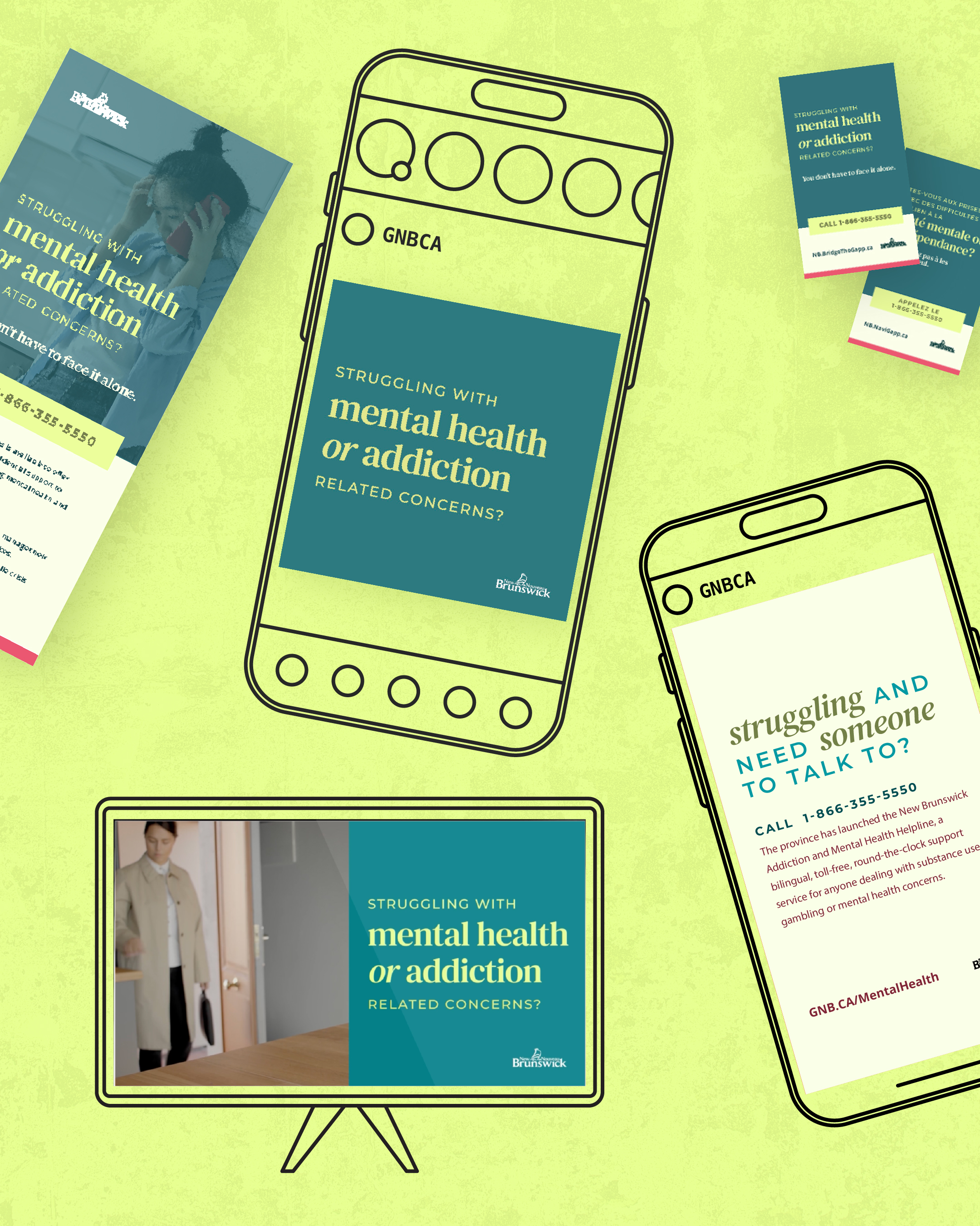
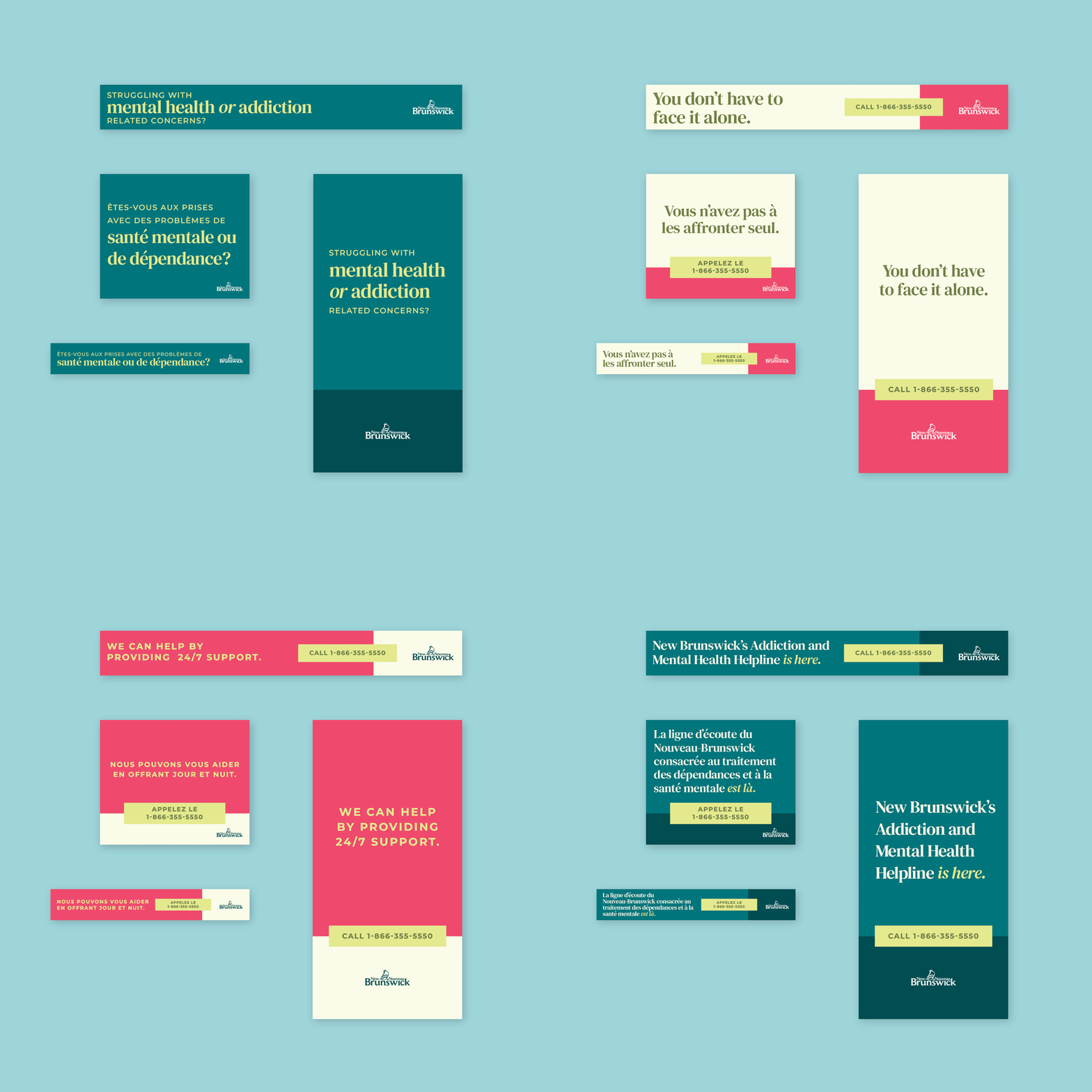
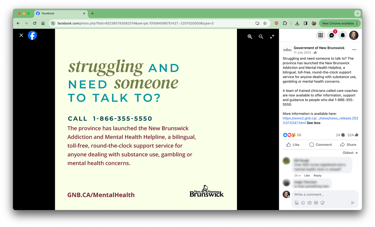
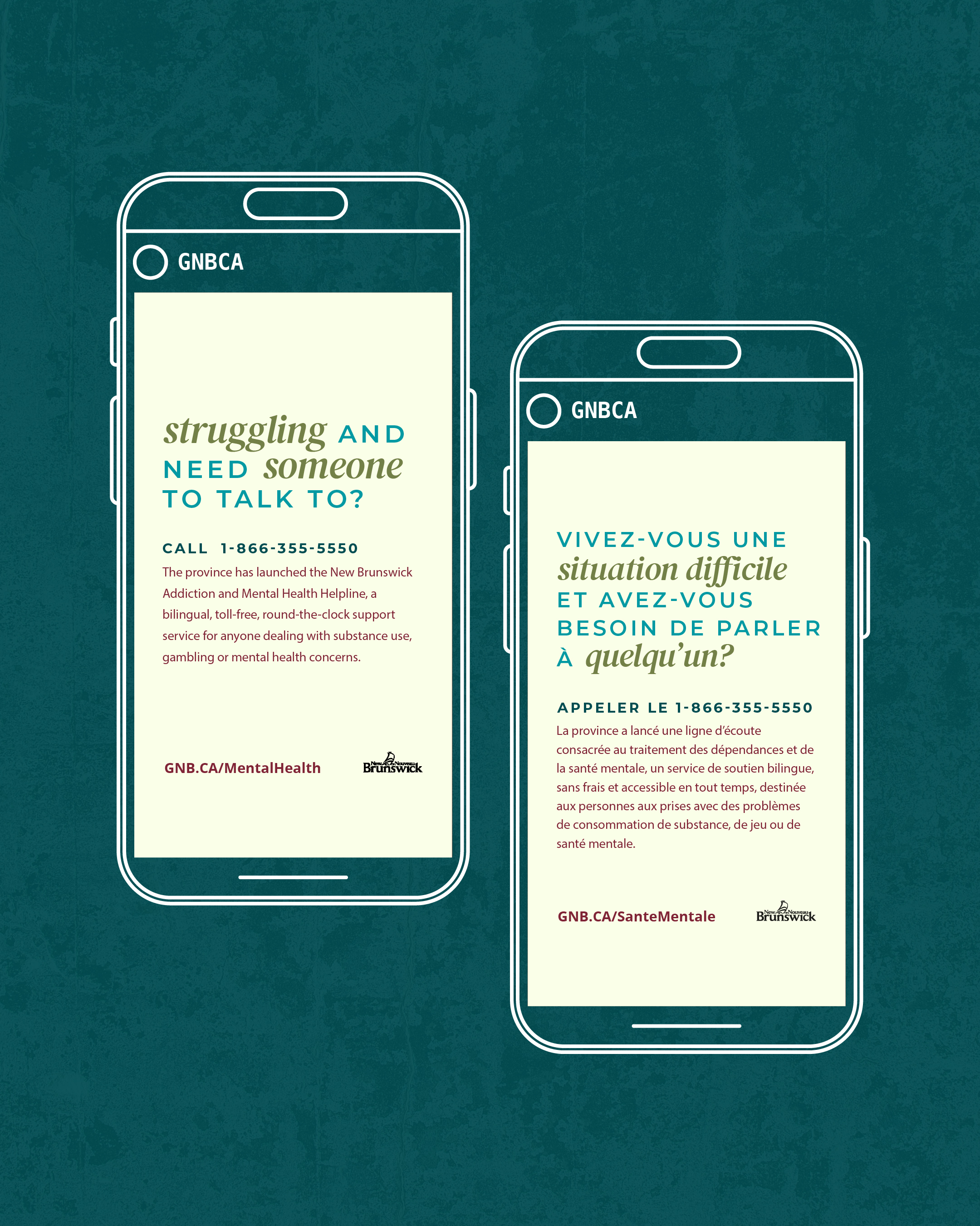
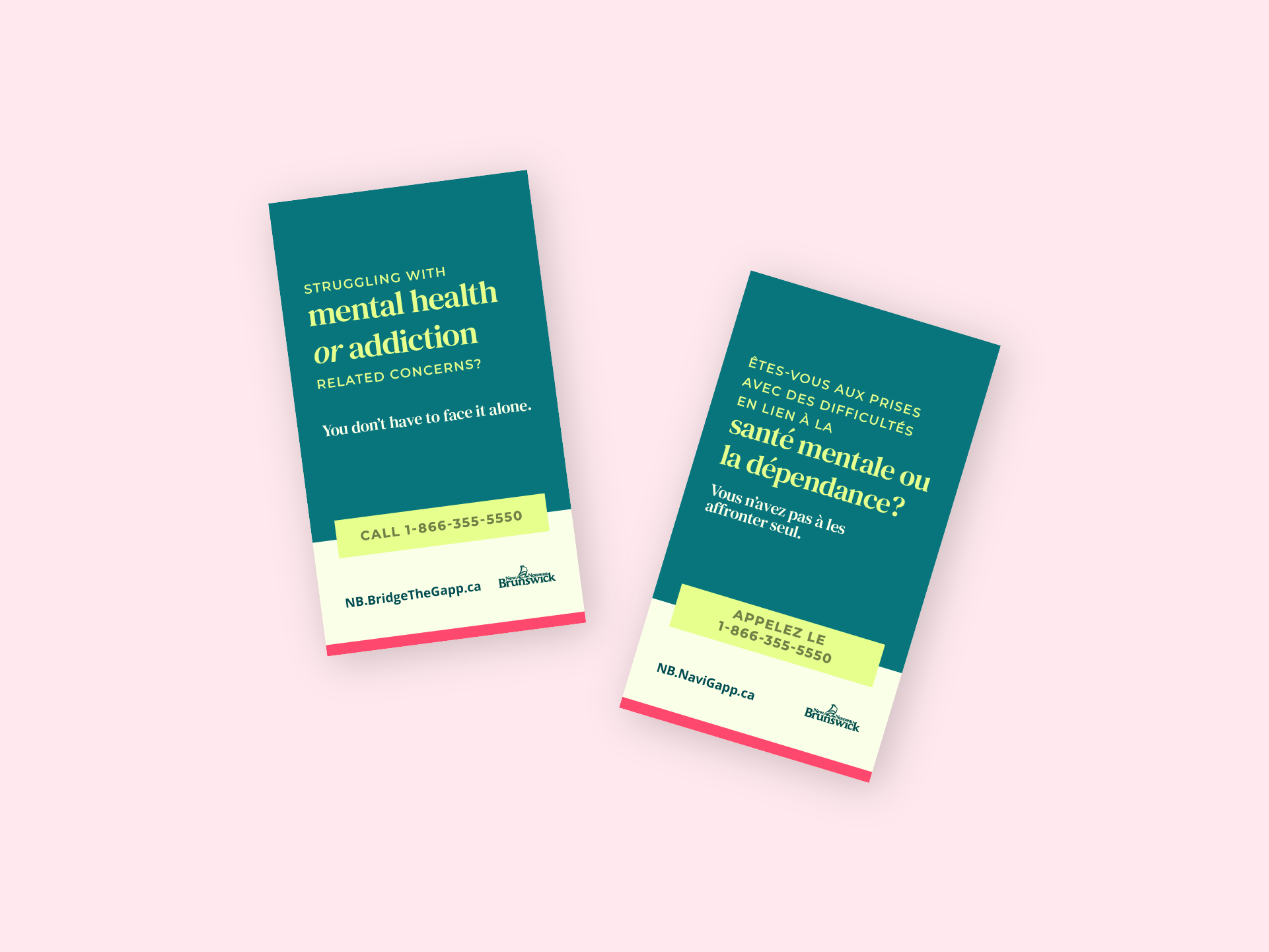
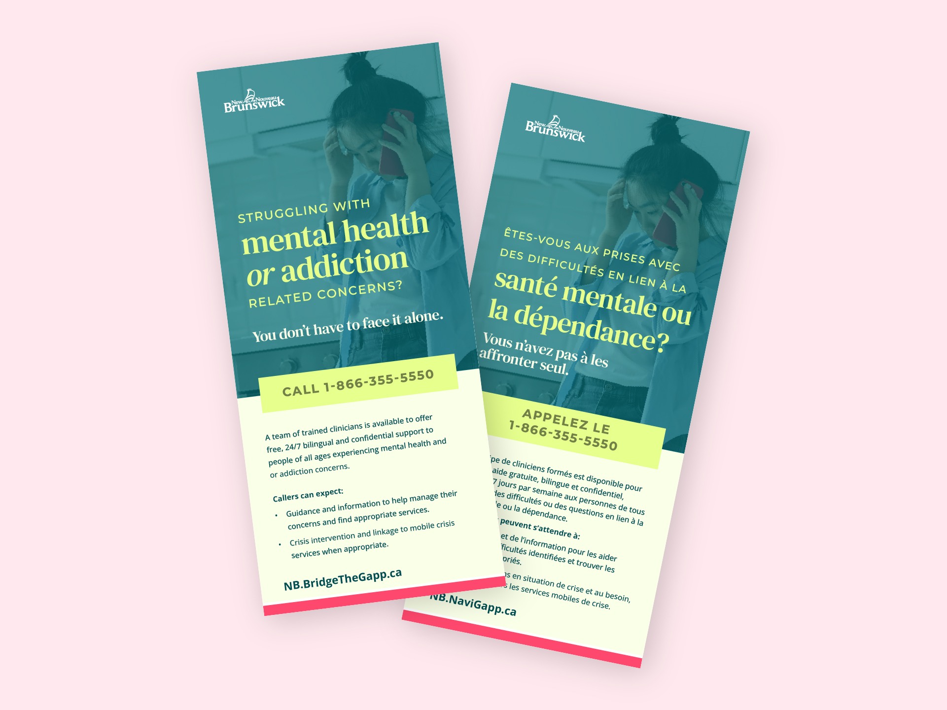
Cards and pamphlets in two sizes, posters, web and YouTube ads, plus paid and organic social, static posts, animated stories and reels.
-
03
Bilingual & accessible
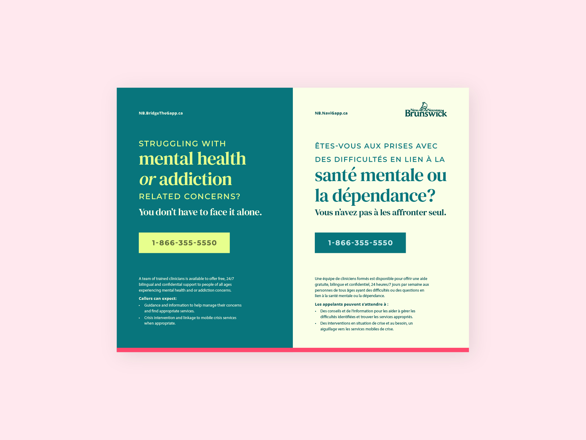
Everything was produced in English and French, with English displayed primarily, and all colour choices tested to WCAG 2.1 Level AA.
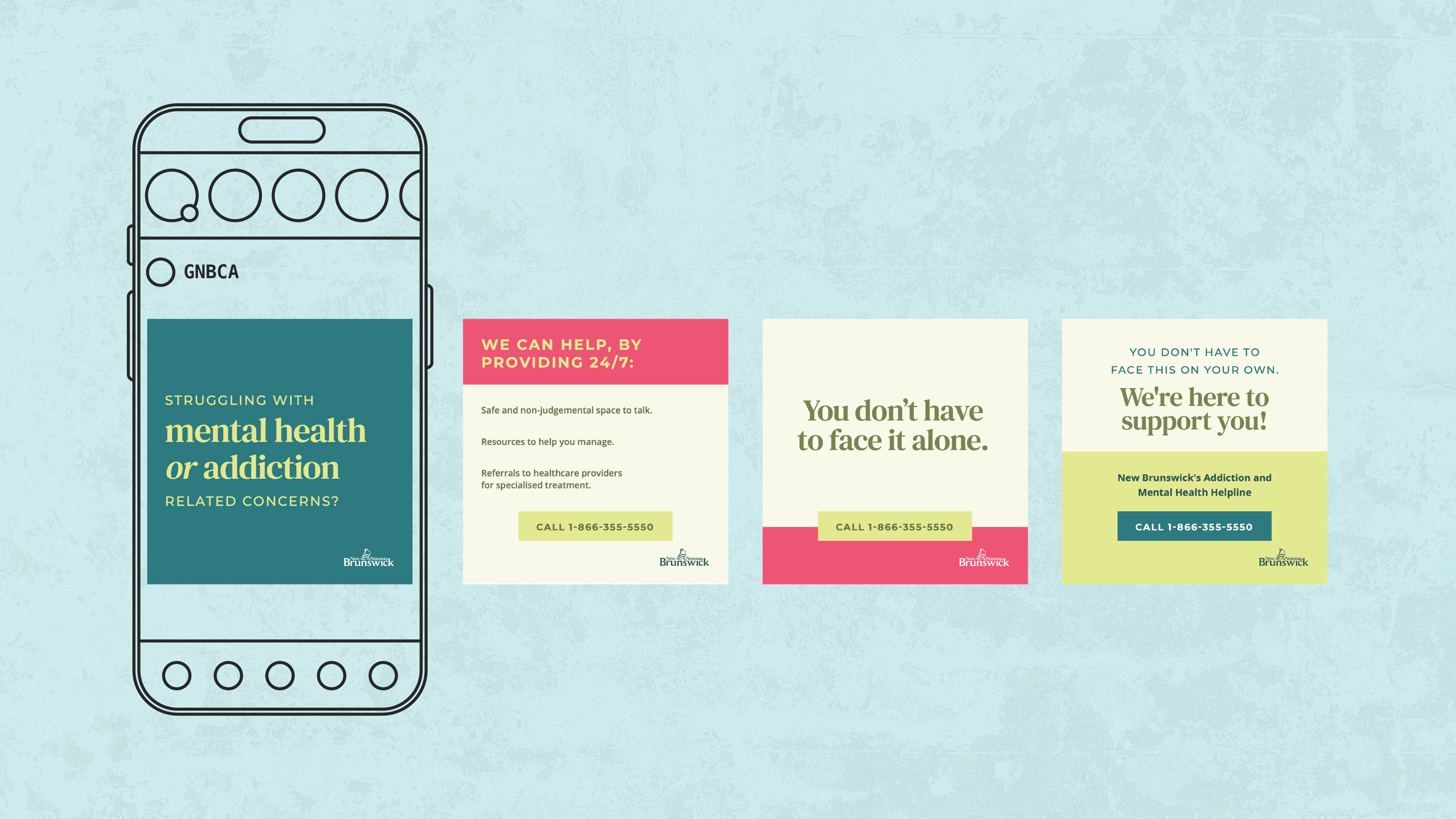
Social Carousel
Three print formats, each designed around how and where someone would actually encounter it. The poster reads as two posters side by side, French and English together, rather than alternating line by line. The pamphlet and wallet-sized handout are double-sided, one language per side, so someone reaching for information in a vulnerable moment immediately sees their language without searching.
During the months the campaign ran, calls to the helpline increased by 14%. For a campaign whose entire purpose was to make people feel safe enough to reach out, that number means something. Good design should make people feel something before they understand why.
14%
rise in calls to the helpline during the campaign
AA
WCAG 2.1 contrast across the palette
EN/FR
bilingual, double the deliverables